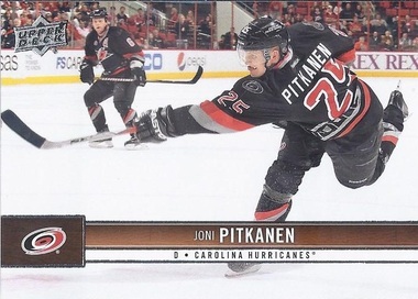
About a month or so back, I decided that I'd just skip the set building nonsense, and just order myself a base, Young Gun-free set of the Upper Deck flagship hockey set via ebay. It worked out to just under a dime a card, which was fine by me. With the season looking doomed, it seemed like a reasonable way to get the goods.
I'd actually planned on going through them to highlight some of my favourite photos in the set, and with it looking like there's actually going to be a season, today sounds like as good a day as any. Top 25. Sure? I could have done this with the Score as well, but I'd rather work my way through 200 cards than 548.
I'm just going through them in numerical order.
#11. A great shot of a stretching Tuukka, with there being a bonus of a great mask photo that I'll have to pick up a second one of for that binder.
#12. This one is just perfectly framed, with the puck slipping in just at the left edge of the card.
#18. This one is probably my favourite among the goalie mask photos in Series 1. As with Tuukka, a second one will certainly be grabbed from a dime box for the mask binder.
#32. The extension of the shot comes off perfectly on the horizontal card. A great use of the style.
#60. A perfect photo for the retiring Lidstrom. Nick over at Dime Boxes calls them sunset cards. I couldn't think of a better way to send off Nicklas, cardboard style.
#64. You're going to see a lot of these ice level shots. They're always spectacular, especially when you can see the banners showing the franchise's past glory in the rafters.
#69. There are quite a few celebratory shots in the set as well. Only two made my list, and this one is my second favourite of that style.
#74. Another great overhead shot.
#90. As for my favourite celebration shot. If one comes out in Series 2 that is better than this one of Cal Clutterbuck, I'd love to see it. The best thing is that it is a celebration card for someone far better known for his fists than his scoring touch.
#93. Another nice overhead shot.
#111 and #113. As with #64, a nice low shot, and a reminder that there were some great years in Islanders history.
#124. A nice bench shot from the Winter Classic.
#126. A sprawling Craig Anderson with his eye on the bouncing puck. Another one that I'll have to pick up a second of for the mask binder.
#128. Another great use of the horizontal style. Daniel did pop in 2 goals in a game in Winnipeg, so I'm guessing this was one of them.
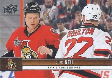
#131. Seeing a fight on a card is a rarity. Contrasting, his celebration card in the Score release is one of my favourites in that set also. That's probably for the same reasons Cal Clutterbuck's UD card is one of my faves here.
#132. A card back? Yup. One with a nice toothless picture. Plus, it disproves the old joke. What do you call a hockey player with all his teeth? A rookie.
#143. I really like the introduction shots as well. This one is my favourite of the Series 1 bunch.
#150. I'm not at all a fan of Cooke's style, but how can one hate a card where he's approaching the puck like he's eying a buffet table?
#168 & #171. Another pair of low shots.
#174. How does a Leaf card make my favourite list? Someone to the left of the card is having fun with Acrostics. Some permutation of "Lose and Ever" is written on the sign of a fan in what seems to be Winnipeg.
#180. A great ice level shot doesn't have to be looking up at the player. Here's a nice shot of a vaulting Burrows.
#190. A rather unflattering bench shot of a rather lumpy Brooks Laich.
#193. Much like with Eller, a beautiful overhead shot.
Is it time for the puck to drop yet?


Wow, those are some nice photos! I'm especially partial to the Lidstrom and Kronwall myself. I'm also celebrating (sort of) hockey's return with a post later too!
ReplyDeleteSuch a great photography set. Usually hockey cards are painfully boring.
ReplyDeleteI can only assume you omitted the Zetterberg in The Big House with the Michigan helmet due to Gary Betteman being visible on the card.
ReplyDeleteIf there had been a Winter Classic 2013, that would easily have been my #1 card of the set.
DeleteI'd go with either the Chris Neil or Alexander Burrows card as the best. They both have images that you rarely see in hockey cards. Burrows is such a dynamic action shot at an angle where you usually get a close up of goalie ass. The rare part about about the Neil card is seeing a picture of fighting. it's part of the game that is ignored by NHL licensed hockey cards.
ReplyDelete