The easiest way to get me to purchase a repack is to put a Mets card at the front of it. Here's a better look at that opening card. Chrome and Ginter seem wrong together, but they don't look too bad in hand. The Rutte card I posted at the start of my trip was an insert from the 2021 version of this set. So I guess I'm learning to like it.
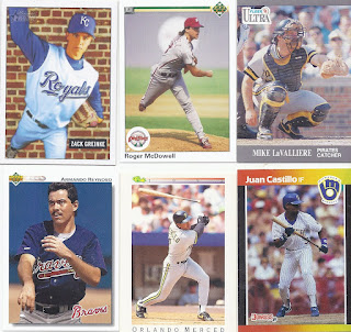
That brick background on the Greinke looks really goofy, especially with a sorta-action shot in front of it. It looks so much better when it is the bricks of Wrigley behind a home plate photo on a card like the Ultra. Looks like a lucky fan is about to get a very unique souvenir courtesy of Orlando Merced,
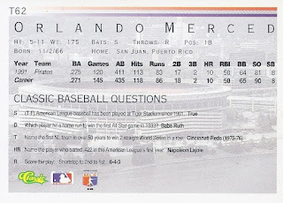
Also courtesy of Orlando, enjoy some trivia!
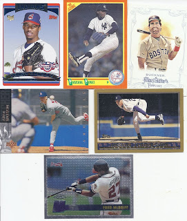
3 straight horizontal cards makes for an unexpected repack portion, and they all are interesting uses of the medium. The Watson design gives me vibes of what Upper Deck is using this year for their flagship set, but show you can use something similar, and still use interesting photos. Such a dull release this season.Now that's an interesting hit. Getting a logo-ed baseball autograph from Panini, and having it be of a longtime major leaguer makes for a great card. Even when the numbering shows off exactly how many stickers they had at Panini HQ. Given the opening card for this as a late 2020 release, it is somewhat unexpected to get this, since Watson had passed before this repack was assembled. But a cool auto is still a cool auto, and I'm definitely happy with it.
Another Mets card! There's also some Canadian content with the pride of the Maritimes, Vince Horsman. 1990 Bowman remains as boring in baseball as it is in hockey.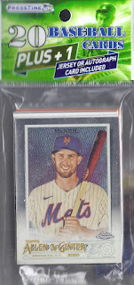



Not a bad auto!
ReplyDelete