The 20-21 portion of my Jamal Murray PC is pretty bare. I've got a couple cards from a Certified break, but that's all. Let's add some variety to the local product some company in there.
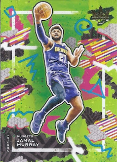
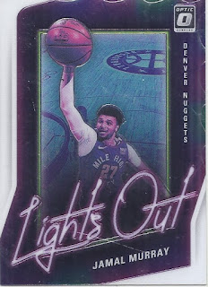
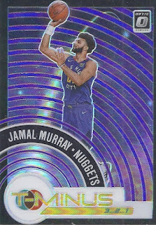
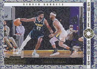
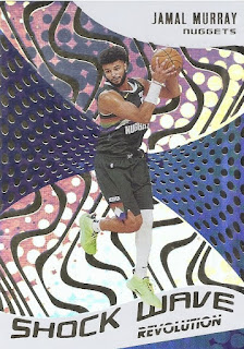
Always garish, but never unwelcome, this Court Kings entry is the only base card for him in the latest COMC mailing. And although the design is bright, it is the only card in the group that really didn't have a foil feeling to it.The whole design on this makes it look like this could be a die-cut card, but it isn't. The design around the coloured portion of the card does make it look non-rectangular. Thankfully, that makes this far easier to store. At least based on the cards I added, they really liked purple in the designs for Optic this year.I've seen this design called Marquee before in other releases, where there's a nice sparkly effect when you turn the card. Like if Sportflics wanted to hypnotize you.One more insert to wrap this up. Even more shininess.There you have it!
No comments:
Post a Comment